

How can you be certain that your employees are engaging with your emails the way you intended? Use click maps in combination with your email analytics to gather detailed engagement insights and optimize your internal email design.
Your email metrics may tell you whether an employee opened your email or clicked on a link therein. But they can seldom tell you why certain emails get more attention or clicks than others. Detailed internal email analytics are important because they give insight into what your employees like to engage with, specifically.
Email click maps a useful feature of ContactMonkey’s internal email platform help you determine how your email design influences your employees’ email engagement, and add crucial context to your internal email metrics. Let’s explore how you can use internal email click maps to create better email designs and connect with your employees.
What Is a Click Map?
A click map measures where your employees are clicking within your email. It does this by superimposing your click data on top of your email design, so you can understand how your link locations and design choices influence your overall click-through rates.
How email click maps help with internal communications
Click maps are super useful for optimizing your internal communications. No matter how you structure your internal communications, the way you present information to your employees will always influence how they interact with it. Click maps help you understand and improve your internal email design by allowing you to:
- Identify strong and weak points of your email design and email templates.
- See what email content resonates with your employees.
- Contextualize patterns in your email metrics that are influenced by your email design.
- Discover design insights to make your email easier for your employees to read and understand.
The goal of any internal communication is to convey information to employees in a simple and concise manner. Click maps show you how your employees engage with your internal emails so you can recognize and remove as many information obstacles as possible.
How to Use Click Maps to Optimize Internal Emails and Newsletters
For every email you send using ContactMonkey’s internal communication solution, you’ll have access to a click map of that email’s engagement. Let’s explore how you can view your click map data, and how you can use that information to drive more engagement with your internal communications.
Get powerful email analytics and reporting features
Know exactly who is opening and engaging with your employee communications and company newsletters.
Explore analytics & reporting

Step 1: Sign up for ContactMonkey
If you’re not already using ContactMonkey, you’ll need to sign up before you can try out click map reports. Just book a free demo to get an introduction to the product and get started on a free trial!
Once you’re set up, log in to your ContactMonkey account to get started.
Pro tip: Learn the key differences with respect to email analytics with ContactMonkey vs Mailchimp and why you should avoid using external marketing tools for internal comms.
Step 2: Send an employee email or email newsletter
To view an internal email click map, you’ll need to send an email to measure first.
Note: Not every internal email you send will produce a meaningful click map; click maps for emails with simple designs or minimal links will be mostly blank.
Internal email heatmaps help you understand engagement on complex internal communications and are best used on email newsletters with deliberate design choices and numerous links.
For an in-depth guide on creating and sending an effective internal email communications, we recommend you check out this blog on creating engaging internal emails and sending them to your employees.
Pro tip: Not every internal email needs to be sent to every employee; keep your internal communications targeted to relevant employees using ContactMonkey’s List Management feature.


Step 3: Review your click map in your Reports menu
In the Reports menu, find the email you sent and click on it, which will open its Campaign Overview. Within the Campaign Overview, you can view all the internal email campaign analytics and metrics for that email send.
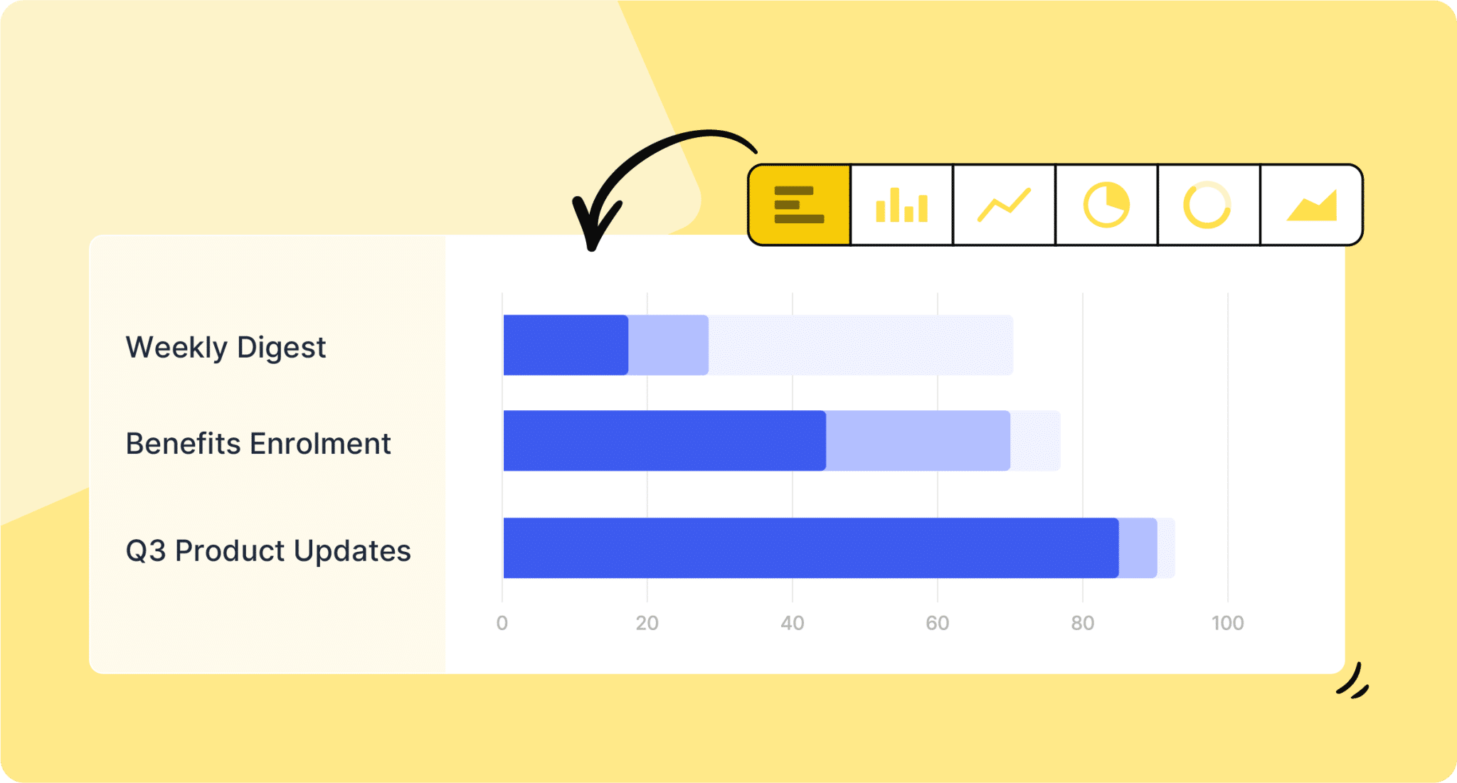
Select the Click Map tab at the top of your Campaign Overview to view your click map report. You’ll be shown the email you sent with various Click Breakdowns superimposed on top of it:

There will be a Click Breakdown for each link you included in your email. Click Breakdowns show you how many clicks that link got compared against the total number of clicks your email received in total. They will also show you how many unique clicks that link received, meaning how many different recipients clicked on that link:

If your email contains a large number of links, you can apply filters to your click map to view only certain Click Breakdowns, which can help you identify your highest and lowest performing links.
Step 4: Use your Click Map to contextualize your other email metrics
So you’ve gathered your Click Maps data—now what?
The main benefit of internal email heatmaps is seeing your email engagement metrics compared to your email design. If you notice certain links performing better or worse than others, you can note various factors that could contribute to this:
- Does your email design encourage your employees to notice your links? Are you following email design best practices to create an engaging layout for your emails?
- What information is being linked to and how relevant is that information to the purpose of your email? In the example image in the previous section, links with information related to the email content performed much better than the company’s social media links.
- Where is your link located? Links that are visible upon opening the email will almost always perform better than those appearing further down in your email.
- Are your links clear and obvious to your recipients? Links with contrasting colours and designated placements within your emails are easier for your employees to notice.
These are just some of the insights you can gather from using Click Maps to analyze your email engagement. In the next step, we’ll explore how you can apply these insights to improve your email design.


Step 5: Apply your Click Map insights into future internal communications
After analyzing your internal company newsletter Click Map and taking notes on your design, it’s time to change your email design based on your findings.
Whether you’re simply changing the colour of your links or trying a brand new email layout, it’s always best to set up internal email benchmarks to compare your changes against one another.
Analyzing your Click Map data: A practical example
Let’s look at a quick example of how to analyze email design via Click Map data. This is a Click Map from a recent ContactMonkey internal newsletter:

You can see that the middle CTA button is getting less attention than the other two buttons. What’s notable is that the button below the middle button is getting more attention than the middle button; this is unusual given that the middle button is located higher up in the email, as information positioned closer to the top of an email tends to get more attention. We can glean several insights from this:
- Employees may not be as interested in the content of the middle section compared to the other two sections.
- Copy on the CTA may not be as compelling to employees compared to the other two CTAs.
- Content closer to the left margin of your email may get more attention from your employees compared to content closer to the right margin.
Using these insights, you can then experiment with changes to your email design. Try rewording that middle CTA, or positioning it in a different location. If your design changes don’t influence your email newsletter heat map data, you can confidently assume that it is the content itself that employees aren’t interested in.
Use email benchmarks to inform your Click Map data
We suggest looking at the average click-through rate of any given email design and using that as a basis for your future changes:
Your goal should be to increase your click-through rate via the changes you make to your email design. In addition to your own benchmarks, you can use ContactMonkey’s Email Benchmarks Report to see how other companies within your industry perform on their internal communications.
If you notice an increase in engagement after making your design changes, then stick with the new design across multiple email sends. If you notice a drop in your engagement, again, stick with it for a few email sends—if the low engagement continues, try making some new changes. As always, compare your engagement metrics against your industry benchmarks to contextualize the data you’re measuring.
Create internal emails that get opened and read
No design or technical expertise needed. Save time, increase engagement, and dazzle your employees with fun and interactive communications.
Explore email features

Ultimately, refining your email design is a trial-and-error process. Internal company newsletter Click Map reports give you internal email data to inform this process so you’re not left guessing about the impact of the changes you’ve made.
Perfect Your Email Design with Click Maps
As the old adage goes, knowledge is power. The more you know about how your employees interact with your internal communications, the better equipped you are to improve how you share information with your organization.
Internal email click maps provide you with a powerful way to compare your email metrics with your email design. By viewing your click data directly within a visual representation of your email, you can better relate to your employees’ experience of reading your internal emails. Combined with ContactMonkey’s suite of powerful internal email analytics, you’ll have the email heat maps tool you need to design the best internal communications for your unique audience.
Start analyzing your internal emails today by booking a free demo of ContactMonkey. You’ll be set up on a free trial where you can see firsthand how ContactMonkey makes your internal communications better.


 1")