This June, our product team introduced a feature that will offer greater insights into employee email campaign performance
What’s New
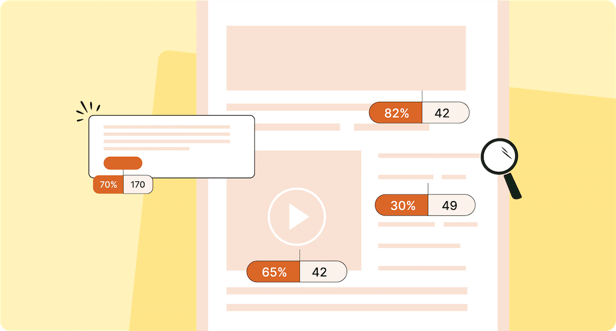
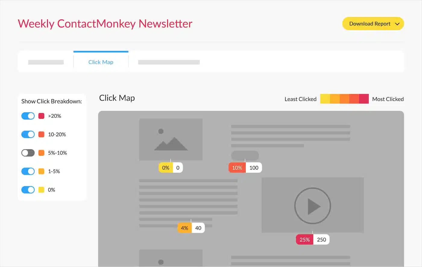
Click Maps
Click Maps is an exciting new feature that will provide a heatmap-style visual representation of email link engagement. With Click Maps, users can view the number of clicks and the click rate of various elements within the email such as CTA buttons, videos, images, and URLs. This is a great way to further inform your internal communications strategy, by identifying which content was least and most effective in engaging your employees.
Key Benefits:
- Better visualize email performance data
- Get useful, specific insights on your email content
- Strategically optimize your employee email communications based on email engagement trends
How to View Link Performance Reporting With Click Maps
Interested in learning more about ContactMonkey’s email solution for Outlook and Gmail? Book your free personalized demo to have all your questions answered.


 1")